rnalysis.filtering.CountFilter.scatter_sample_vs_sample
- CountFilter.scatter_sample_vs_sample(sample1: ColumnNames, sample2: ColumnNames, xlabel: str | Literal['auto'] = 'auto', ylabel: str | Literal['auto'] = 'auto', title: str | Literal['auto'] = 'auto', title_fontsize: float = 20, label_fontsize: float = 16, tick_fontsize: float = 12, annotation_fontsize: float = 10, highlight: Sequence[str] | None = None, point_color: Color = '#6d7178', highlight_color: Color = '#00aaff', opacity: Fraction = 0.65, point_size: float = 10, interactive: bool = True, show_cursor: bool = False) Figure
Generate a scatter plot where every dot is a feature, the x value is log10 of reads (counts, RPM, RPKM, TPM, etc) in sample1, the y value is log10 of reads in sample2. If the plot is generated in interactive mode, data points can be labeled by clicking on them.
- Parameters:
sample1 (string or list of strings) – Name of the first sample from the CountFilter object. If sample1 is a list, they will be avarged as replicates.
sample2 (string or list of strings) – Name of the second sample from the CountFilter object. If sample2 is a list, they will be averaged as replicates.
xlabel (str or 'auto') – optional. If not specified, sample1 will be used as xlabel.
ylabel (str or 'auto') – optional. If not specified, sample2 will be used as ylabel.
title (str or 'auto') – optional. If not specified, a title will be generated automatically.
title_fontsize (float (default=30)) – determines the font size of the graph title.
label_fontsize (float (default=15)) – determines the font size of the X and Y axis labels.
tick_fontsize (float (default=10)) – determines the font size of the X and Y tick labels.
annotation_fontsize (float (default=10)) – determines the font size of the point annotations created in interactive mode.
highlight (Filter object or iterable of strings) – If specified, the points in the scatter corresponding to the names/features in ‘highlight’ will be highlighted in red.
point_color (str or tuple of (int, int, int) (default='#6d7178')) – color of the points in the scatter plot.
highlight_color (str or tuple of (int, int, int) (default='#00aaff')) – color of the highlighted points in the scatter plot.
opacity (determines the opacity of the points in the scatter plot. 0 indicates completely transparent, while 1 indicates completely opaque.) – float between 0 and 1 (default=0.65)
point_size (float (default=10)) – determines the size of the points in the scatter plot
interactive (bool (default=True)) – if True, turns on interactive mode. While in interactive mode, you can click on a data point to label it with its gene name/ID, or click on a labeled data point to unlabel it.
show_cursor (bool (default=False)) – if True, show the cursor position on the plot during interactive mode
- Returns:
a matplotlib axis object.
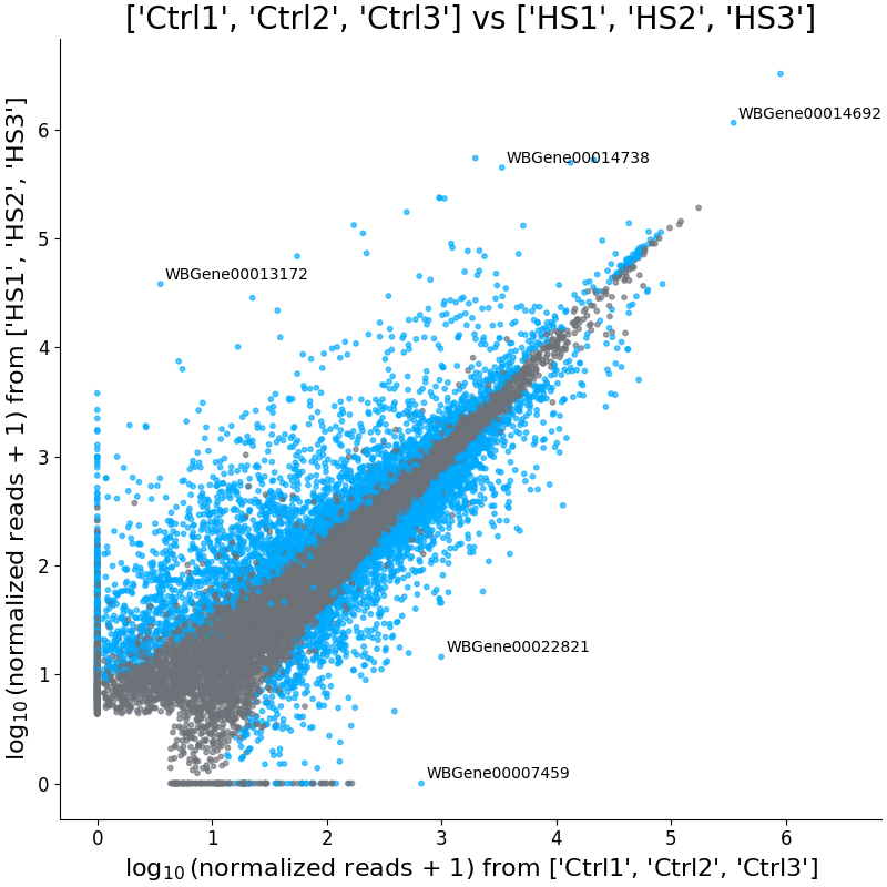
Example plot of scatter_sample_vs_sample()