rnalysis.filtering.CountFilter.enhanced_box_plot
- CountFilter.enhanced_box_plot(samples: GroupedColumns | Literal['all'] = 'all', scatter: bool = False, ylabel: str = 'log10(Normalized reads + 1)', title: str | Literal['auto'] = 'auto', title_fontsize: float = 20, label_fontsize: float = 16, tick_fontsize: float = 12) Figure
Generates an enhanced box-plot of the specified samples in the CountFilter object in log10 scale. Can plot both single samples and average multiple replicates. It is recommended to use this function on normalized values and not on absolute read values. The box indicates 25% and 75% percentiles, and the white dot indicates the median.
- Parameters:
samples ('all' or list.) – A list of the sample names and/or grouped sample names to be plotted. All specified samples must be present in the CountFilter object. To average multiple replicates of the same condition, they can be grouped in an inner list. Example input: [[‘SAMPLE1A’, ‘SAMPLE1B’, ‘SAMPLE1C’], [‘SAMPLE2A’, ‘SAMPLE2B’, ‘SAMPLE2C’],’SAMPLE3’ , ‘SAMPLE6’]
scatter (bool (default=False)) – if True, adds a scatter-plot on top of the box-plot.
ylabel (str (default='Log10(RPM + 1)')) – the label of the Y axis.
title (str or 'auto' (default='auto')) – The title of the plot. If ‘auto’, a title will be generated automatically.
title_fontsize (float (default=30)) – determines the font size of the graph title.
label_fontsize (float (default=15)) – determines the font size of the X and Y axis labels.
tick_fontsize (float (default=10)) – determines the font size of the X and Y tick labels.
- Return type:
matplotlib Figure.
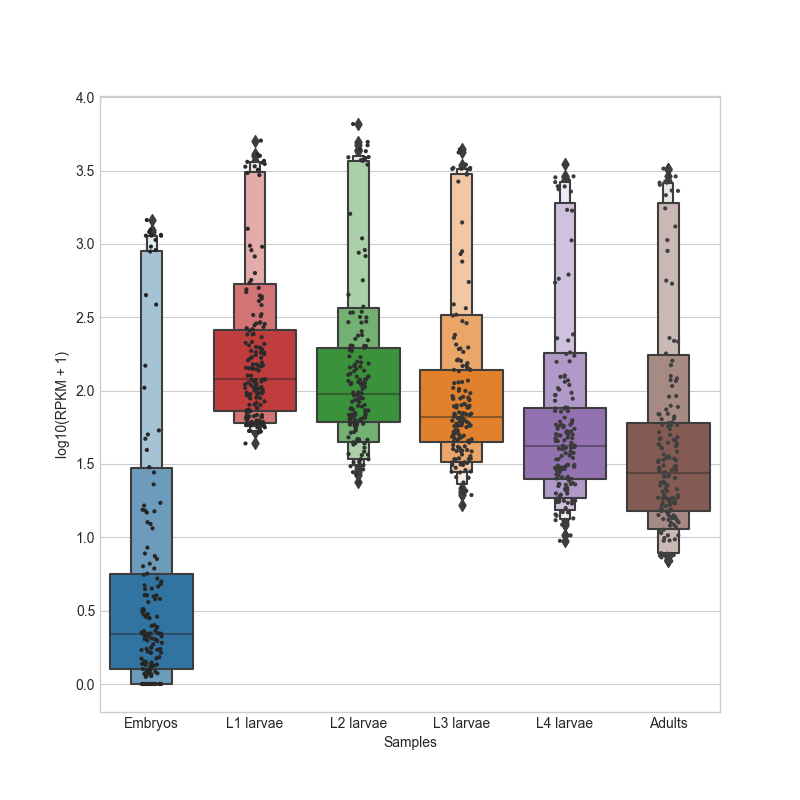
Example plot of enhanced_box_plot(add_scatter=True)