rnalysis.filtering.CountFilter.pairplot
- CountFilter.pairplot(samples: GroupedColumns | Literal['all'] = 'all', log2: bool = True, show_corr: bool = True, title: str | Literal['auto'] = 'auto', title_fontsize: float = 30, label_fontsize: float = 16, tick_fontsize: float = 12) Figure
Plot pairwise relationships in the dataset. Can plot both single samples and average multiple replicates. For more information see the documentation of seaborn.pairplot.
- Parameters:
samples ('all', list, or nested list.) – A list of the sample names and/or grouped sample names to be included in the pairplot. All specified samples must be present in the CountFilter object. To average multiple replicates of the same condition, they can be grouped in an inner list. Example input: [[‘SAMPLE1A’, ‘SAMPLE1B’, ‘SAMPLE1C’], [‘SAMPLE2A’, ‘SAMPLE2B’, ‘SAMPLE2C’],’SAMPLE3’ , ‘SAMPLE6’]
log2 (bool (default=True)) – if True, the pairplot will be calculated with log2 of the DataFrame (pseudocount+1 added), and not with the raw data. If False, the pairplot will be calculated with the raw data.
show_corr (bool (default=True)) – if True, shows the Spearman correlation coefficient (R) between each pair of samples/groups.
title (str or 'auto' (default='auto')) – The title of the plot. If ‘auto’, a title will be generated automatically.
title_fontsize (float (default=30)) – determines the font size of the graph title.
label_fontsize (float (default=15) :param tick_fontsize: determines the font size of the X and Y tick labels.) – determines the font size of the X and Y axis labels.
- Returns:
A matplotlib Figure.
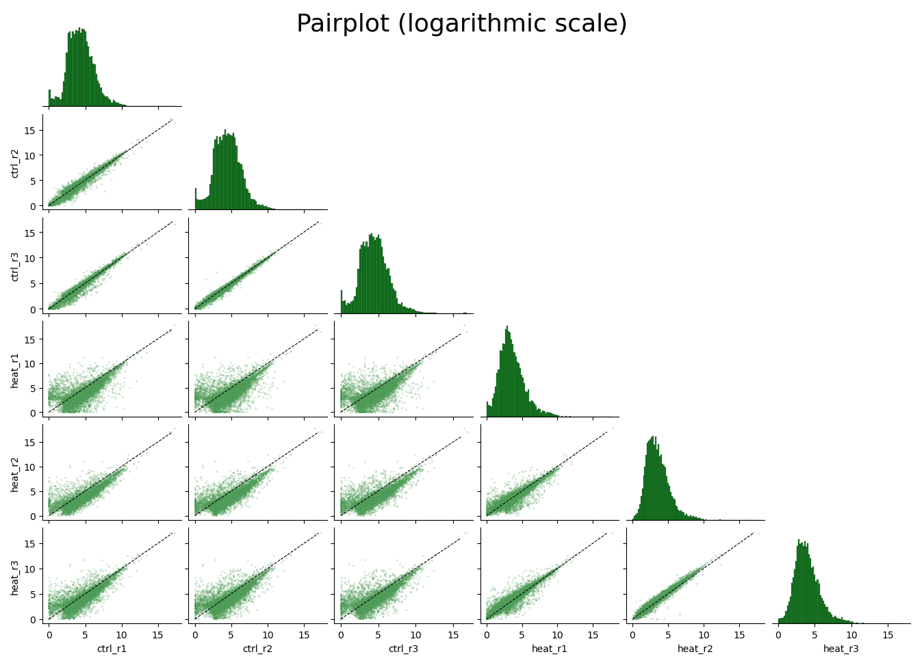
Example plot of pairplot()